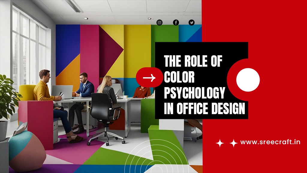
Creating an office space that promotes productivity, well-being, and creativity is crucial in today’s fast-paced work environment. Color is one of the most effective yet often overlooked tools in office design. The colors surrounding employees can significantly impact their mood, energy levels, and overall performance. This concept, known as color psychology, is essential for businesses seeking to optimize their workspaces. By understanding the psychology of color in office design, companies can make informed choices that enhance the environment and foster positive outcomes. This blog explores how specific colors like blue, green, and yellow can influence productivity and creativity in office settings and why choosing the right palette is vital for workplace success.
The Power of Color Psychology in Office Design:
Color psychology in office design is more than just an aesthetic choice—it’s a strategy. Various studies have shown that colors can evoke emotional responses and influence behavior. For example, soft, neutral tones can make a room feel calm, while bright, bold colors can stimulate energy and excitement. The right color choices in office design can help employees feel more motivated, reduce stress levels, and even enhance focus.
The psychology of color has been explored for centuries, but it’s only recently that it has become a key consideration in office design. Sree Craft, an expert in designing workspaces, understands the profound impact of color choices. Whether a company wants to improve focus, foster creativity, or create a tranquil space, color can make a world of difference.
Choosing the Right Colors for Office Design:
The right color scheme is vital for balancing the diverse needs of an office environment. Each color has its psychological impact, and combining the right shades can lead to a well-rounded and dynamic space.
1.Blue for Focus and Productivity:
Blue is often associated with intelligence, logic, and efficiency. It’s a calming color that can reduce anxiety and help employees maintain focus for extended periods. Because blue promotes clear thinking, it is frequently used in environments where concentration and productivity are priorities. For instance, offices with blue tones may see improvements in tasks requiring accuracy and attention to detail.
Different shades of blue can evoke varying effects. A light blue may feel more soothing, while a darker blue adds professionalism and authority to a space. Incorporating blue into the design of meeting rooms or areas where problem-solving and brainstorming are common can help boost performance.
Companies looking to foster a calm, focused atmosphere might consider using blue in workstations or conference rooms where concentration is essential. At Sree Craft, we recommend blending blue with neutral tones like white or gray for a balanced and sophisticated look.
2.Green for Calm and Balance:
Green is the color of nature and is closely associated with feelings of calm, relaxation, and balance. In the context of office design, green is known to reduce fatigue and eye strain, making it an excellent choice for spaces where employees spend long hours in front of computer screens. Research has shown that green can help to create a sense of stability and calmness, which can, in turn, reduce stress levels.
Incorporating green into break rooms or lounge areas can create a restorative space for employees to relax and recharge. Additionally, green is ideal for collaborative spaces, as it promotes balance and harmony, encouraging teamwork and open communication.
Green also has a subtle, refreshing effect that can uplift the overall atmosphere of the office. Whether through accents like plants or larger design elements like walls or carpets, green brings a touch of nature indoors, helping to improve employee well-being. Sree Craft often integrates green hues in common areas to promote a sense of tranquility and encourage relaxation.
3.Yellow for Creativity and Energy:
Yellow is an energetic and stimulating color that is often linked to creativity, optimism, and enthusiasm. It can boost innovation and idea generation, making it an excellent choice for creative spaces where brainstorming and collaboration are common. Yellow’s uplifting nature is also known to increase happiness, which can improve overall morale in the office.
However, because yellow is a stimulating color, it should be used sparingly in workspaces that require focus. Too much yellow can become overwhelming and may even lead to anxiety. To strike the right balance, Sree Craft suggests using yellow as an accent color—whether through office accessories, artwork, or statement furniture pieces—to create a cheerful and inspiring environment without overpowering the senses.
Yellow works best in areas designated for brainstorming sessions or creative departments, such as marketing or design teams. Its positive energy can inspire fresh ideas and bring a sense of playfulness and optimism into the workplace.
Designing a Productive and Balanced Office Environment:
Creating a productive office environment isn’t just about choosing one or two colors—it’s about understanding how different colors can interact to create a harmonious space that meets the needs of your team. For instance, blue and green are often used together to create a calming yet focused environment, while accents of yellow can provide a pop of energy and creativity where needed.
At Sree Craft, we emphasize the importance of personalization in office design. Every business has unique needs, and understanding the company culture, goals, and work patterns is essential for creating an effective color scheme. By taking a holistic approach, businesses can leverage color psychology to create workspaces that not only look good but also enhance employee well-being and productivity.
When designing your office space, consider the following tips:
- Use blue in areas where focus and productivity are essential, such as workstations and meeting rooms.
- Incorporate green into break rooms and relaxation zones to promote calm and reduce stress.
- Add yellow accents in creative spaces to stimulate innovation and collaboration.
- Blend colors with neutral tones like white, gray, or beige to avoid overwhelming the senses.
The Role of Natural Light:
In addition to color choices, natural light plays a significant role in office design. It can influence how colors appear and directly impact employee mood and energy levels. A well-lit space can enhance the positive effects of blue, green, and yellow, making the environment feel more open and inviting. Sree Craft advises maximizing natural light in the office, wherever possible, to complement the chosen color scheme.
Conclusion: Consult an Expert for Office Color Design
The psychology of color in office design is a powerful tool that can shape employee experiences, influence behavior, and boost productivity. By choosing the right colors, businesses can create environments that support their teams’ needs, enhance well-being, and improve performance. Whether it’s the calming influence of blue, the balancing effect of green, or the creative spark of yellow, each color has a unique role to play in shaping a productive and harmonious office.
However, selecting the right color scheme requires a deep understanding of how colors interact with one another and the specific needs of the workspace. That’s where color consultation services come in. Sree Craft, with its expertise in color psychology in office design, can guide you through the process of choosing the perfect color palette for your office.
Let Sree Craft help you transform your office space into a place of productivity, creativity, and well-being by leveraging the power of color. Reach out today for a consultation and take the first step toward creating a more vibrant and effective workspace.


Wow, this piece oof writing is nice, my sister iss analyzing such things, therefore I am going
to tell her.